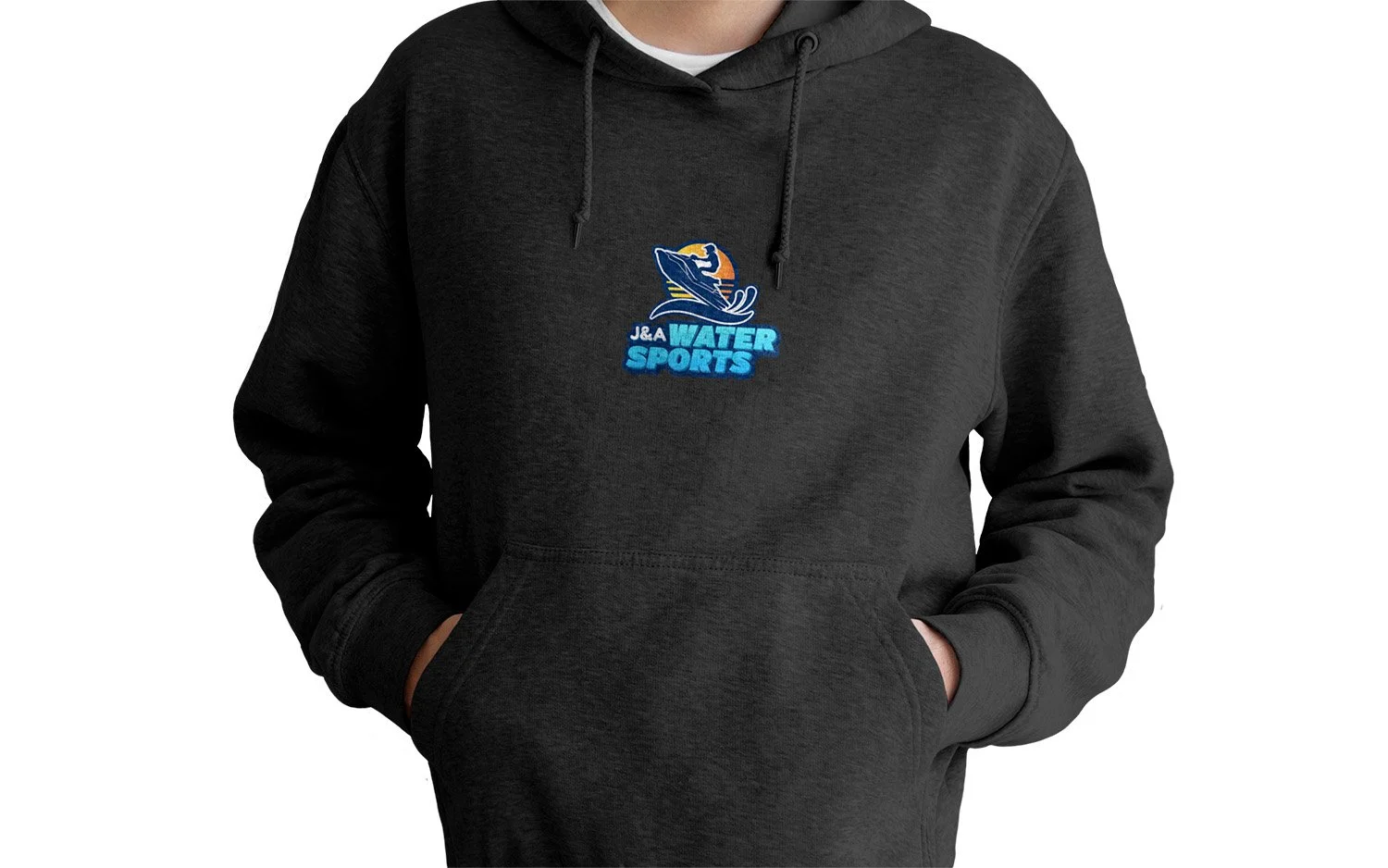
Client: J&A WaterSports
Task: Logo Redesign
Brief: Jose Aldaco and his brother are launching a water sports gear rental company and they require a logo. They needed help with the initial stages of the logo development process.
A few keys to remember is that the logo’s colour must be predominantly blue, and contain a person using a speedboat. Instructions were clear also that they wanted this logo to be bold, and to avoid anything subtle.
Approach: Starting a logo with not much information is always a challenge, however, I knew the key elements to be incorporated, and the logo needed to be bold and without any “subtle” meanings or elements. This limited the use of negative space within the logo as that is the most used technique to incorporate a fun easter egg, because of the clear instructions I opted to not incorporate any easter eggs and make the logo “to the point".
With the finalized logo in hand, I presented it to Trevor and his entire team for their consideration. The response was nothing short of enthusiastic; they were captivated by the fusion of these elements, and it resonated perfectly with their vision.
Endorsement:
“You nailed the style and logo my partner and I were going for. Thank you boss!”
- Jose


