Client: Portable John
Task: Logo Redesign
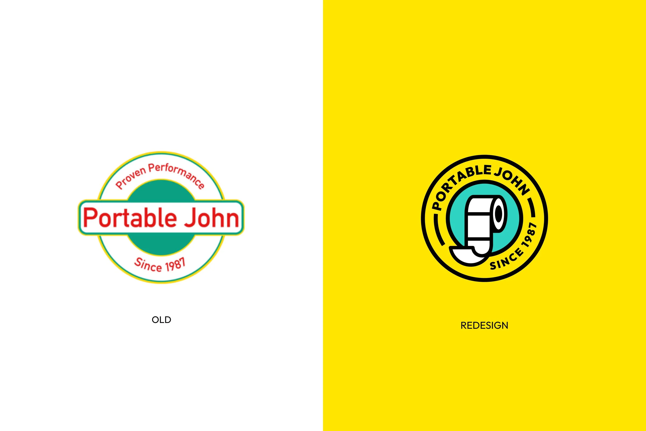
Brief: Redesign my current logo. I want you to keep the colours turquoise, and yellow. I need this redesign to look like it belongs to the 80’s, but I want something subtle, not too flashy. Please get creative with this redesign!
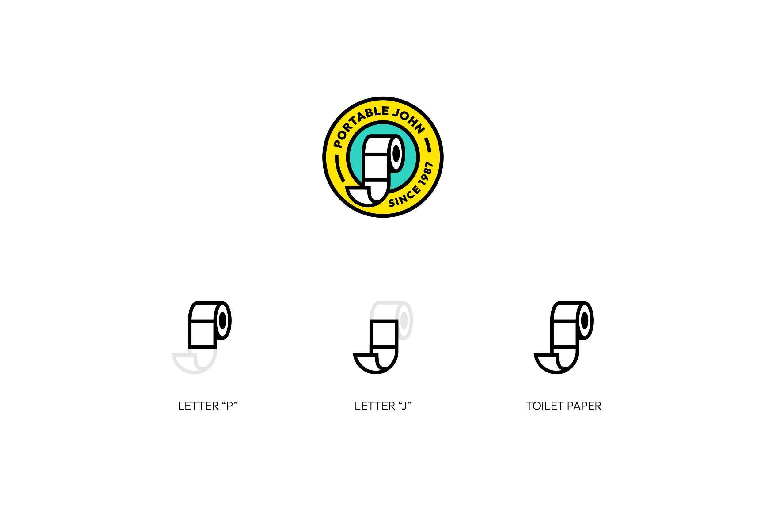
Approach: Upon digging deeper into their rich history and thoroughly exploring their website, it became evident that a humble roll of toilet paper was their most iconic symbol. Inspired by this, I embarked on a creative journey, weaving together three distinct elements to craft the ultimate logo. These elements included the letter "P" for "portable," the letter "J" for "John," and a clever fusion of these two letters shaped into a representation of a toilet paper roll.
With the finalized logo in hand, I presented it to Trevor and his entire team for their consideration. The response was nothing short of enthusiastic; they were captivated by the fusion of these elements, and it resonated perfectly with their vision.
Endorsement:
”Everybody loved the new logo, I have more projects for you!”
-Trevor


